

BY LESLIE REGO
In 1934, President Franklin D. Roosevelt created the Works Progress Administration (WPA) that put unemployed men and women to work. A branch of the WPA was the Federal Art Project, which employed over 5000 artists who created a huge output of art, including murals in hospitals and post offices, paintings for libraries and schools, and posters depicting the national parks. The posters celebrated the new park system being built by thousands of Civilian Conservation Corps workers. An additional outcome was that the posters also brought art to the people. In the 1930s hardly anyone had seen an actual oil painting or had visited a museum. The posters created an opportunity for more citizens to learn about art.
In the creation of these posters, the artists explored new silkscreening techniques. Eventually, they were able to utilize five to six different colors and run off as many as 600 posters a day. The artists designed the posters using Abstract, Constructivist and Bauhaus design, the most avant-garde art movements of the time. The artists simplified complex shapes, employed limited color, and manipulated compressed values. The end result was a strong and graphic statement. These designs would not have been welcomed within the business world for they would have been thought as too revolutionary, but as bold designs urging citizens to visit the national parks, they were eye-catching.
The palette exemplified the thirties with neutral tones suggesting earth, water, and sky. Even though the posters had forceful designs, the muted, understated colors spoke to the hardships and seriousness of the time period. Unfortunately, few of these posters have survived. Many were destroyed when the WPA closed during World War II. Today, the Library of Congress has the largest collection and only a few survive in private collections.
I am intrigued by these impactful art designs. The artists, through bold statements, were able to illustrate the grandeur of the landscape. The strong graphic content exemplified the majesty of the land.
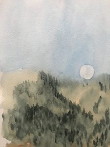
Last week I wrote about the concurrent sunset and moonrise. This was a grand moment when I saw the noble forces of nature in a duel, the sun shooting out pink streaks in the west and the moon serenely rising in the east. The graphic nature of the WPA posters would have exemplified these natural forces in a restrained yet straightforward manner.
For my “poster,” I chose to show the moon just making an appearance over the mountain. I simplified shapes, kept the values close together, and the colors muted.
Leslie Rego is an Idaho Press Club award-winning columnist, artist and Blaine County resident. To view more of Rego’s art, visit leslierego.com.